This report is written by TMI contributor Walker Bragman.
As Georgia has become one of the world’s COVID-19 hotspots, Republican Gov. Brian Kemp has swatted away pressure from experts to shut down the economy, and he has taken punitive action against localities that try to impose mask mandates. It now appears that his administration is also obscuring a graphical presentation of coronavirus data on the state’s Department of Public Health website, the central clearinghouse for information on the public health crisis.
Specifically, as infection rates have skyrocketed, Kemp administration officials have shifted the color-coding of Georgia’s virus tracking map in ways that make it seem as if nothing is changing.
The revelations are the latest example of states obscuring hard data about the pandemic. In May, it was revealed that Texas, Vermont, and Virginia were artificially inflating their perceived testing capacity by combining the totals of the antibody tests and the regular COVID tests. Under scrutiny, all three states changed their reporting method to record the different test types separately.
A new national survey shows more Americans are questioning the severity of the pandemic and how many people are dying, even as coronavirus cases are exploding across the country.
Georgia has become ground zero in the emergency. Conservatives had touted the state as a laudable model of success in allegedly inhibiting the virus while reopening the economy. But cases in the state have steadily risen since the beginning of June, with the seven-day rolling average of cases increasing by 47 percent since July 2.
As Kemp faced criticism for aggressively reopening the economy just before that spike, his health department has been criticized for obscuring the crisis. In mid May, Kemp’s administration issued an apology for falsely presenting downward trends on a bar graph of cases in the five hardest hit counties.
Now, his administration is publishing maps that purport to track infection rates in the state, but that are adjusting color codes in ways that seem to downplay the crisis.
Maps Whose Colors Barely Change, Even As The Emergency Worsens
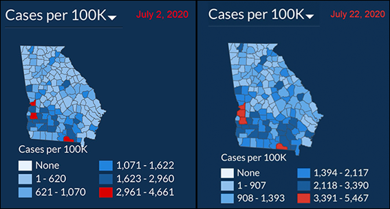
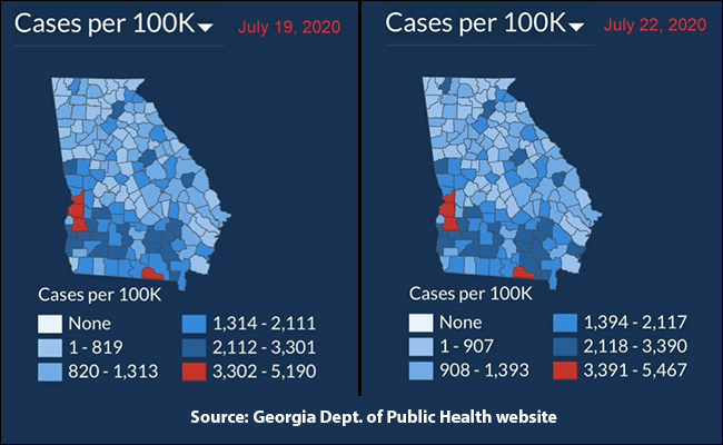
The issue was first pointed out by Twitter user @andishehnouraee, who posted screenshots on July 17 in a widely shared thread indicating that the Georgia Department of Public Health’s county heat map for cases per 100,000 had not noticeably changed since July 2. Some areas were a shade darker, but overall the differences were not immediately apparent. The map remained largely blue with just three red counties signifying large caseloads.
Behind the striking consistency were adjustments to the map’s key—expanding or contracting the maximum number of cases in each tier almost by the day.
On July 2, the maximum case number in the lowest tier was 620. By July 7, that had climbed to 715. By July 17, it was at 949–still with just three counties shaded red. The next day, it was down to 819 cases with four red counties. It remained this way until Monday when the maximum caseload for the bottom tier hit 834. Tuesday, it jumped to 867 and Wednesday 907.
The Georgia Department of Health did not dispute that the heat map keys are being altered regularly. Spokesperson Nancy Nydam told TMI that the changes to the key were done for the benefit of Georgians.
“These maps are not designed to show increases over time, but rather to show density by location and differences between counties,” Nydam explained. “They should not be compared to each other. If the ranges are not periodically reset, the entire map would end up one color and viewers wouldn’t be able to make distinctions between locations.”
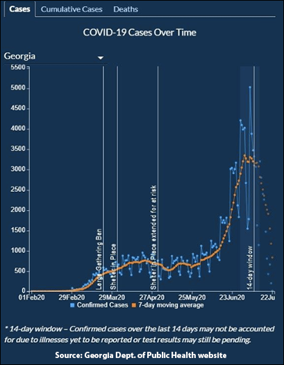
She noted that case trends over time are presented on the website in a different chart.
While that chart does display the upward trend of COVID cases alongside the dates of Kemp’s executive orders, the labeling is almost comically misleading.
It notes for April 27: “shelter in place extended for at risk.” But that’s not all that happened: on the same day, Kemp also started allowing restaurant dining rooms, movie theaters, gyms and salons to reopen.
Follow-up questions such as how the case ranges for the heat maps were decided upon and what role Kemp’s office plays in determining the presentation of information on the department’s website went unanswered.
A call-in assistant for the department previously directed TMI to contact the governor’s office for questions about the maps.
Dr. Jennifer Nuzzo, of the Johns Hopkins Center for Health Security, told TMI that the presentation of information on the Georgia Department of Public Health website “is not easy to interpret.”
“To understand trends we either need to see new case numbers or, better yet, new case numbers compared to recent reports or averages,” she explained, noting that the heat map’s “changing bin sizes” made it “hard to discern how much worse it has gotten.”
“It's not just that the number of red spots changed,” she said, “but that the number of cases per 100,000 for each bin went up so much.”
GOP Governor Continues Reopening As The Pandemic Intensifies
Georgia’s recent surge in coronavirus cases has not deterred Kemp. The governor has followed the lead of the Trump White House, which responded late to the pandemic out of the gate and has since sought to politicize the public health recommendations of the medical community to justify a push to reopen the country prematurely. The president, who polls suggest is facing a difficult reelection campaign, has attempted to cast doubt on the numbers coming out of the Centers for Disease Control and Prevention (CDC), even going so far as to strip the body of control of COVID data.
It took Kemp nearly two weeks to declare a state of emergency after the state confirmed its first two cases on March 2. Two days later, he ordered the closure of schools statewide. It would be another week before the order came banning large gatherings, closing bars and nightclubs, and requiring the state’s medically vulnerable to shelter-in-place. Finally, on April 2, a month after those first coronavirus cases, Kemp issued a statewide shelter-in-place order.
Eighteen days later, however, on April 20, the governor announced that he was easing the restrictions to begin reopening the state. His executive order on April 23 allowed dine-in restaurants, gyms, salons, tattoo parlors, and bowling alleys to resume operations on April 27. The move was heralded by the Trump administration and conservatives.
For a few weeks, the numbers remained relatively constant, as a May 8 opinion piece by Wall Street Journal editor James Freeman noted.
“Not only has the virus curve flattened in the Peach State,” Freeman wrote. “Data from the last 14 days show a welcome trend of declining new cases and deaths.”
But then cases began to surge. Kemp has responded by pushing forward on reopening in spite of the worsening crisis. Over the weekend, he encouraged the reopening of in-person classes at schools across the state.
Kemp also took aim at local mask requirements in a public battle with Democratic Atlanta Mayor Keisha Lance Bottoms. The conflict began on July 15 when Kemp issued an executive order prohibiting cities from mandating the wearing of masks. The order coincided with a visit to the city by Trump, who arrived without a mask. Bottoms pointed out that he was violating the city’s order.
The next day, Kemp sued the city of Atlanta to block enforcement of a number of restrictions related to the pandemic including the mask requirement. Then he blamed the surge in cases on the widespread racial justice protests across the state. Health experts disputed the claim.
This newsletter relies on readers pitching in to support it. If you like what you just read and want to help expand this kind of journalism, consider becoming a paid subscriber by clicking this link.